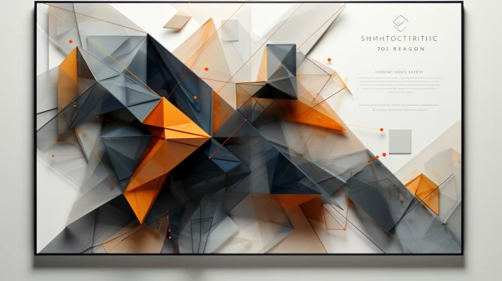
Patterns and textures can significantly contribute to the visual appeal of a certificate, adding depth and enhancing the design’s overall aesthetic. From subtle background textures to more prominent patterned elements, the strategic use of these design components can create a distinctive and engaging certificate. This article explores the ways to apply patterns and textures in certificate design.
Understanding Patterns and Textures
Patterns are recurring elements or sequences in a design, while textures refer to the surface quality or “feel” of an object. In graphic design, textures are often used to create visual interest or a sense of depth.
Background Textures
A subtle texture applied to the certificate’s background can add a tactile quality, making the certificate appear more substantial and sophisticated. This can be especially effective in digital certificates, where visual cues are crucial for simulating a physical experience.
Patterned Borders
Borders are a classic area to incorporate patterns in certificate design. A well-designed patterned border can frame the certificate content and draw attention to the central information. The choice of pattern should align with the overall style of the certificate, whether it’s formal, modern, or playful.
Patterns in Typography
Patterns can also be applied within typography to create a unique visual effect. This technique should be used sparingly, typically for larger text elements like the recipient’s name or the certificate title, to maintain readability.
Texture in Decorative Elements
Decorative elements, such as seals, logos, or symbols, can be enhanced with the application of textures. This can add a sense of depth and realism to these elements, further enhancing their visual impact.
Considerations for Pattern and Texture Use
When applying patterns and textures, it’s crucial to maintain a balance. Too many patterned elements or overly textured surfaces can make the design appear busy or cluttered, detracting from the certificate’s main purpose: to highlight an achievement.
Moreover, the choice of patterns and textures should align with the overall design style and the brand identity if the certificate is issued by an organization. Consistency in design enhances the certificate’s credibility and recognition value.
Utilizing patterns and textures in certificate design can create a richer visual experience, enhancing both the aesthetic appeal and perceived value of the certificate. Whether subtly applied in the background or used more prominently in borders or typography, these design elements can add depth, interest, and a sense of tactile quality to the certificate. However, the key to their effective use lies in understanding balance and ensuring consistency with the overall design style and brand identity. With careful consideration, patterns and textures can significantly elevate the art of certificate design.


