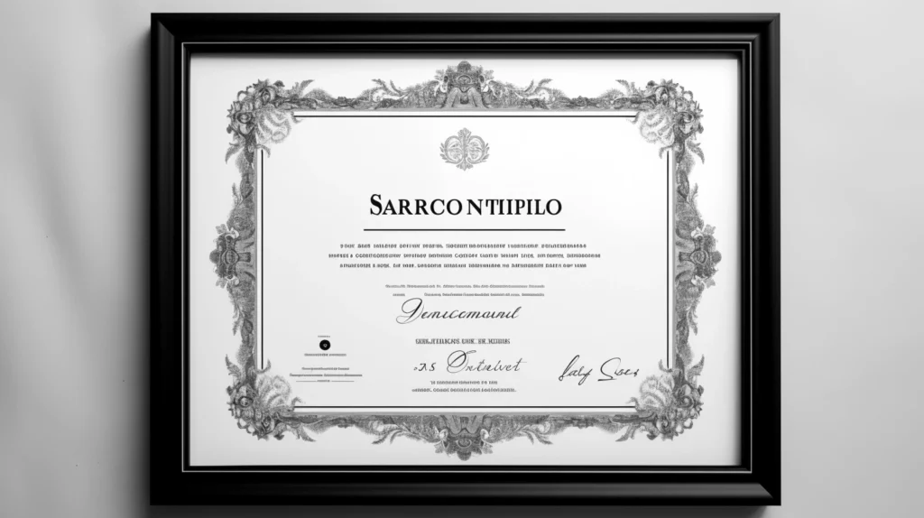
Typography, the art and technique of arranging type, is a crucial element of any design work, especially in certificate design. An effective use of typography can elevate the design, contributing to its aesthetic appeal and communicating its significance to the recipient. This article discusses some of the best typography techniques to consider when designing a certificate.
Understand the Basics of Typography
Before diving into design specifics, it’s essential to understand the fundamental concepts of typography. This includes knowledge of typefaces (such as Serif, Sans Serif, Script, and Display), font sizes, line lengths, spacing, and alignment. A thorough understanding of these elements can help a designer select the appropriate typeface and font for the certificate, contributing to a balanced and readable design.
Hierarchy of Text
In certificate design, creating a hierarchy is key to directing the viewer’s attention to the most important elements. The most significant information such as the recipient’s name or the award title should be the most prominent. This is usually achieved by manipulating size, weight (boldness), and position of the text elements.
Choosing the Right Typeface
When it comes to certificate design, not all typefaces are created equal. The typeface should align with the certificate’s purpose and the message it aims to convey. For instance, Serif fonts, with their classic and formal feel, are often suitable for academic or professional certificates. In contrast, more casual or creative certificates may benefit from Sans Serif or Script typefaces.
Contrast and Balance
Using contrasting typefaces can add interest and highlight specific elements in your design. This could mean pairing a Serif typeface with a Sans Serif one, or combining a decorative Script font with a more straightforward, clean font for readability. However, it’s important to maintain balance and not to overdo contrast, as it could lead to a chaotic design.
Use of Space
Space is a fundamental element in typography. Adequate space around the type allows it to ‘breathe’ and enhances readability. In certificate design, designers should ensure generous margins and suitable spacing between lines (leading) and characters (kerning).
Incorporation of Other Elements
While the focus is on typography, remember that certificates often include other elements such as logos, seals, or decorative motifs. These elements should complement the typography and not distract from it. For instance, if the logo is intricate and visually dominant, the typography might need to be simple and understated to maintain balance.
The power of effective typography in certificate design cannot be understated. A strong grasp of typographic principles, from typeface selection to spacing and hierarchy, can transform a certificate from a simple document into a meaningful and valued piece of design. While trends in typography continue to evolve, the principles of good design remain: clarity, readability, and visual balance. By implementing these techniques, designers can ensure their certificates carry not only the weight of the achievement they represent but also a sense of aesthetic excellence and harmony.


